


WEB, UX / UI, VISUAL DESIGN
I was hired to come up with the concept and design for the 2017 Thesis Archive Site as part of my position as a Resident Research Fellow for 2016-2017. This year’s concept draws from the Thesis Archive’s past as a printed book. Centered around a horizontal scrolling homepage that evokes an abstracted bookshelf, visitors can explore projects, filter projects by category or advisor, or search by student names. The site’s structure is designed to provide a simple and fun browsing experience of over 110 projects, and to accommodate audiences both within and outside of ITP.
Designer & Art Director
Concept, Wireframes, UI Design, Icon System
Katherine Dillon, Lead
Yining Shi, Developer
2017
The main design challenge of the ITP Thesis Archive site is creating a structure that can accommodate a large amount of diverse content (this year, 110 projects).
The primary audiences to consider in the design process were:
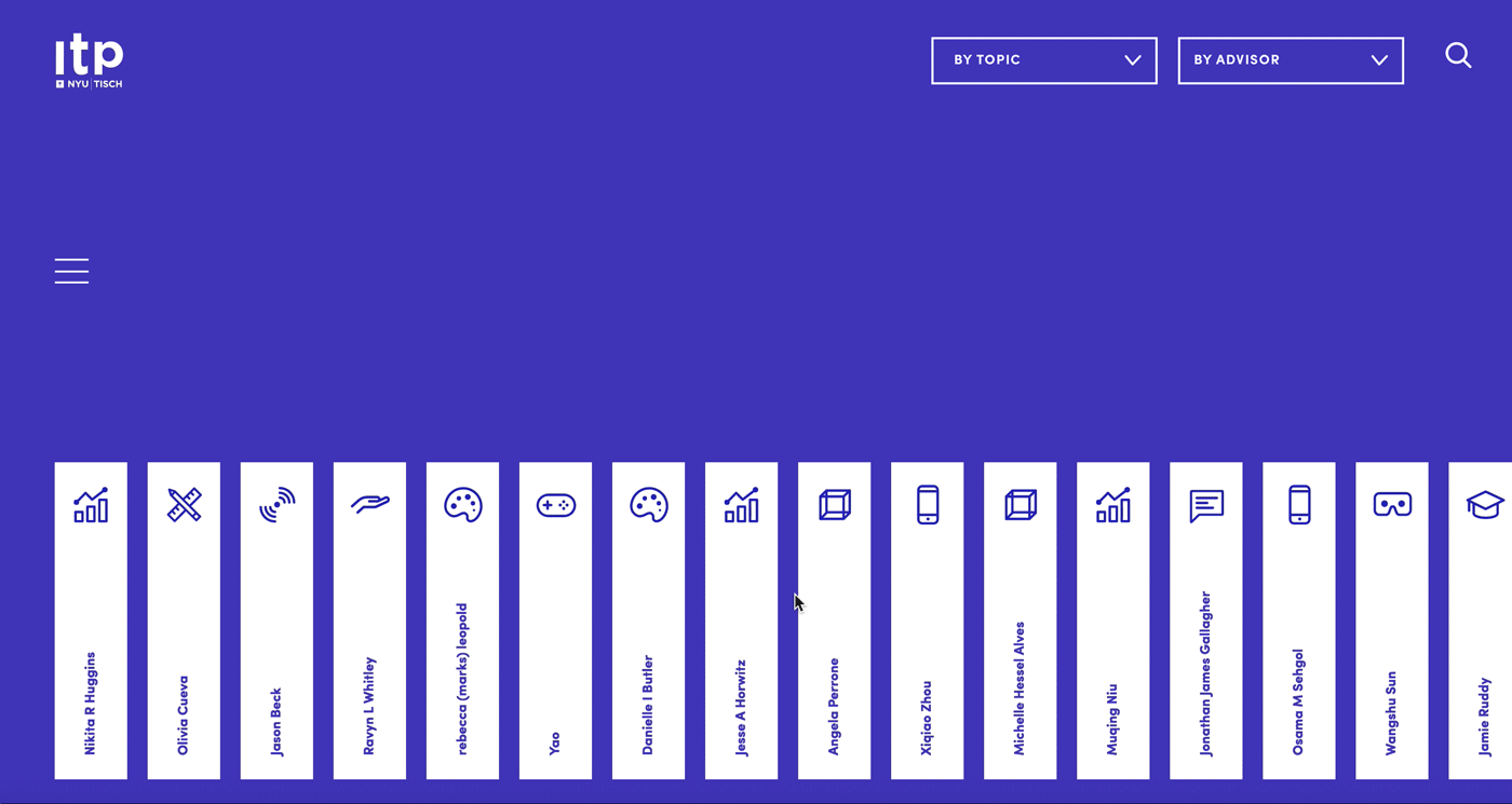
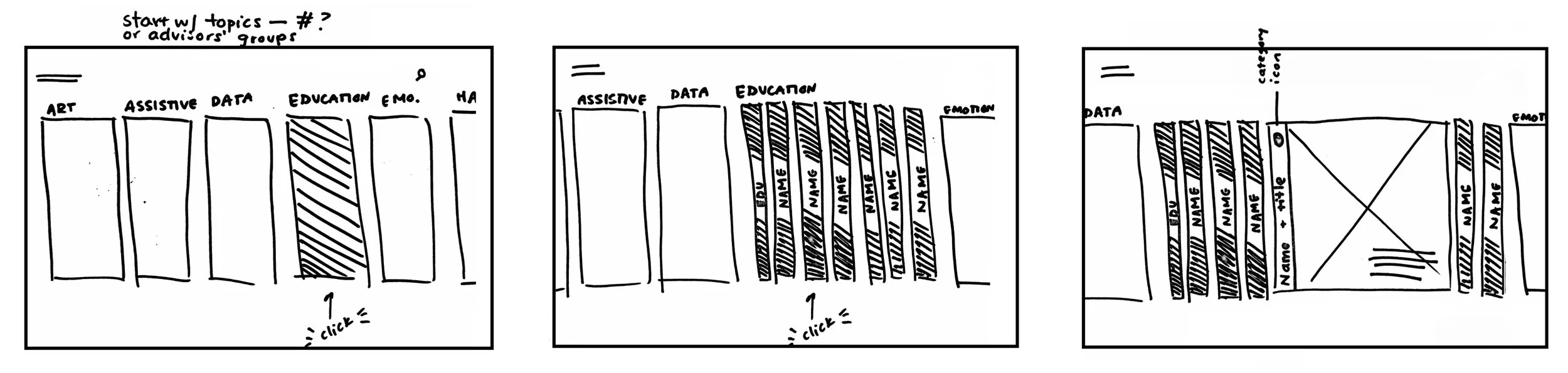
As a departure from last year’s grid based site, we decided to create a horizontal-scrolling site that allowed people to browse projects, search and filter, and view individual project pages. In early sketches, I explored the idea of a site grouped by category blocks that contained individual projects.
The wireframing process consisted of many iterations, both in terms of the information architecture as well as the page layout. We explored horizontal and vertical scrolling, and different structures for exploring the projects (see sketches above).
One major question that came up was the importance of filtering the projects by category and advisor. Earlier versions of the wireframes kept the filters hidden on the homepage (as seen below), which made for a visually cleaner homepage but also required an extra click. We eventually decided to display the filter dropdowns and search field prominent on the homepage.
The UI design was kept simple, like a blank canvas that would allow the individual projects to shine. The visual palette of the site consists of only two colors (alongside white and grey), bold typography and a system of icons that I designed to represent each of the 24 project categories, from VR to wearables to Internet of Things. Most of my focus with the UI was dedicated to details and microinteractions.
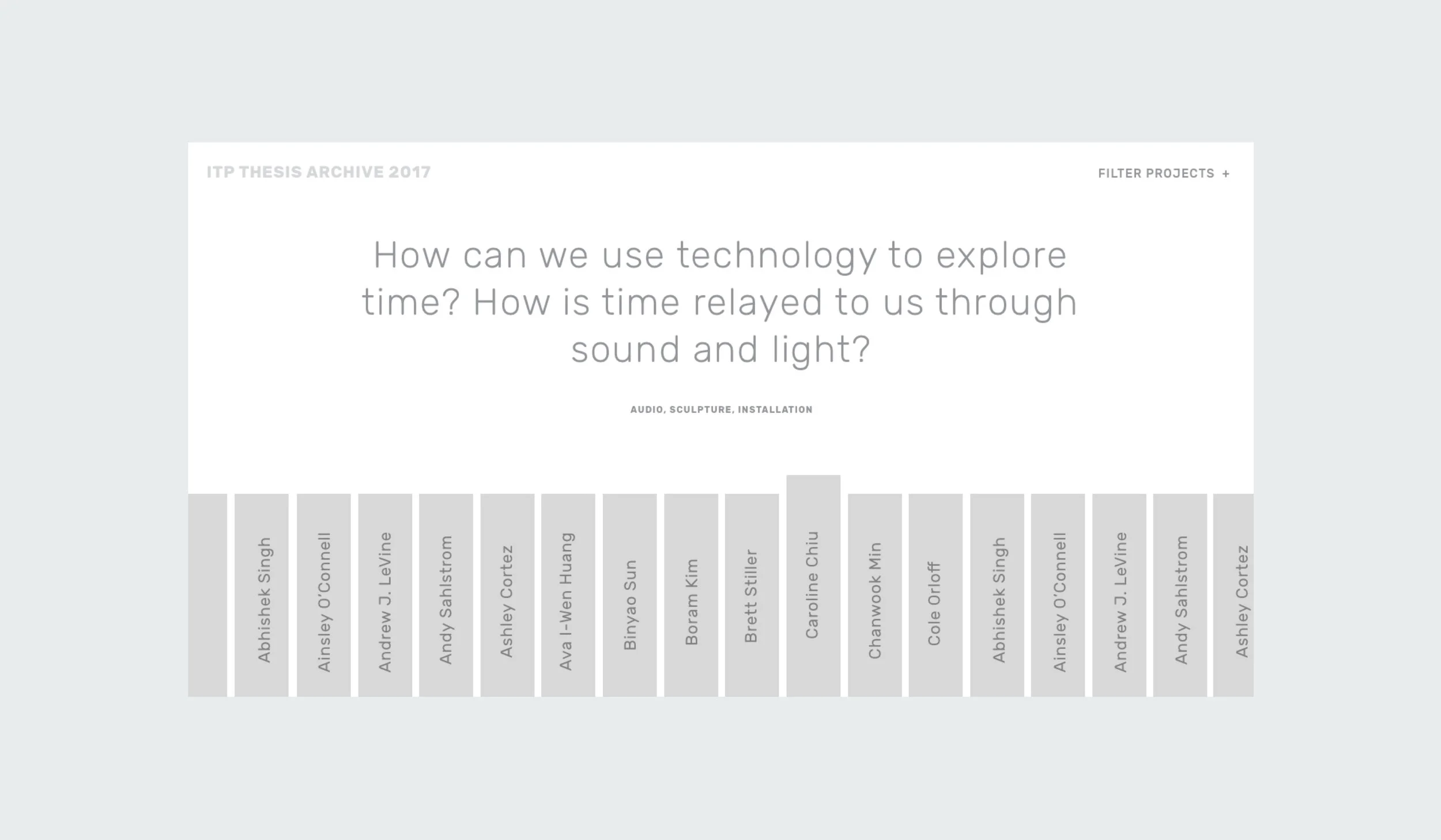
Homepage: On the homepage (below), visitors can scroll horizontally through the projects, which are displayed in a random order each time the page is reloaded. When a visitor hovers over a student’s name, the thesis question that guided their project is revealed in large type along with the project categories. This is designed to give people a preview before clicking through to the individual project page.
Filter and Searching Pages: There are a few main use cases for filtering and searching the projects. Visitors from the general public can filter projects by category if they want to see something specific (ie all VR, or all data visualization). People within the ITP community can filter projects by specific thesis advisor. Lastly, friends and family of ITP can search for specific students to see their work.
Project Page: The project page was designed as a simple template that would work well with the diverse range of projects that come out of ITP. It consists of a main header, buttons to browse next and previous project (based alphabetically), and space for written and visual documentation.
Static Pages: Static pages with information about ITP, the thesis process and credits are revealed when clicking the hamburger menu on the homepage.
I designed a system of icons that represent each of the 24 project categories. Category icons appear on the homepage and on each individual project page.
A mobile version of the site preserves many of the main interactions available on the desktop version. Visitors can still search, filter and browse through projects. The project question reveal on hover is disabled and not part of the mobile experience.